[ INFO ]
PROJECTS
︎︎︎ Dogmas, Disobedience & Disbelief
︎︎︎ I Swear To God/我对天发誓
︎︎︎ Show Me The Meaning
︎︎︎ Paper Thin
︎︎︎ Handmade Buddha Head for ONLY £19.89
︎︎︎ Look At Me!
GRAPHICS
︎︎︎ Get Lost Publication
︎︎︎ Studio Photography
WRITING
︎︎︎ Chinese Traditional Crafts in Singapore
︎︎︎ Dollar Thoughts
BRANDING + ADVERTISING
︎︎︎ Bringing You Home – Singapore Airlines
︎︎︎ Father & Son
︎︎︎ Scared Pain? – DAME
︎FUN STUFF︎
︎︎︎ Ceramics
︎︎︎ 35mm
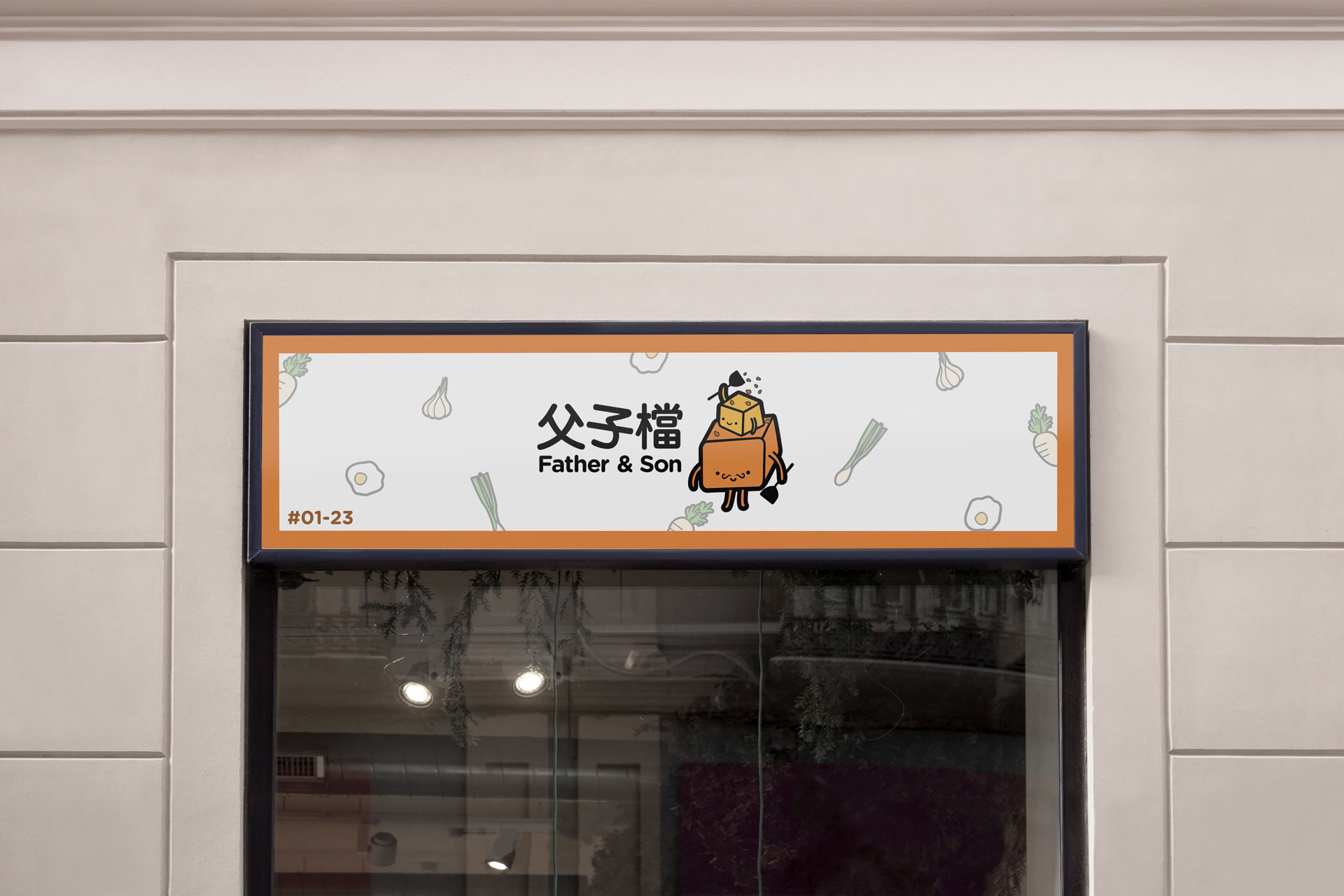
FATHER & SON – HAWKER REBRAND
[2018]
The symbol shows 2 cuboids stacked one above another. The cuboids represents the carrot cake, and the 2 characters symbolise the father and son, as they run the business together. This is also why each one is holding a spatula, as when frying carrot cake, it is very common to use 2 spatulas. Each one holding one spatula shows how they are working together to run the business. The ‘son’ is also throwing cai poh over his head. Cai poh (Pickled radish) is one of the key ingredients in Cai Dao Kway, as it is the ingredient that gives the dish its flavour. The cuboids are made disproportionate dileberately as this adds to the unrealistic and cartoony effect to emphasize the brand image of being laid-back, sincere and welcoming. A logo that looks appealing to all ages would make them look much more approachable as well.


THE CROWBAR AWARDS 2018
Branding Category – Bronze
Branding Category – Bronze
